Discord is a free application that provides users with the ability to communicate with one another through various methods, including text messaging, voice calls, and video chats, offering a convenient platform for real-time interaction.

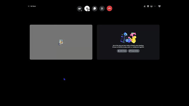
As you can see, this is what it looks like when you're on a call, both on desktop and mobile devices. The layout and functionality remain consistent across platforms, ensuring a seamless experience regardless of the device you're using.


Though I’ve noticed that users have a hard time spotting this icon because it’s tucked away in the far top-right corner. The placement makes it a bit tricky to find or use quickly, which could affect the overall user experience.
Based on this observation, I've decided to create an iteration by incorporating the UI design elements of the Discord icons, focusing on their arrangement and placement within the interface. My goal is to adapt these design principles and apply a similar layout on the desktop, ensuring a seamless and intuitive user experience that mirrors the cohesive and functional design seen in Discord's mobile version. This approach will not only enhance usability but also bring consistency across platforms.
mobile reference

Before

After

To better illustrate the user interface changes, I created a detailed before-and-after comparison showcasing the chat icon on the Discord website. This visual highlights not only the difference in its positioning but also how its behavior changes across various screen sizes and user interactions. The goal was to emphasize how these adjustments enhance overall usability, accessibility, and visual consistency throughout the platform.
Before


After


To further refine the layout, I designed two alternative versions with the goal of optimizing space usage without compromising on clarity or simplicity. Each version explored different ways to balance functionality and visual hierarchy while preserving a minimal aesthetic. This allowed me to evaluate which layout offered a better user experience, particularly in terms of readability, focus, and overall flow.
Iteration A

Iteration B
Based on the research and feedback I gathered, Iteration B stood out as the most promising. People found it easier to use and felt the layout made things clearer and more intuitive compared to the other versions A.
Iteration B
Discord recently updated their user interface, but the chat icon is still located in the upper-right corner. If it were up to me, I would have implemented the changes I explored, as they make Discord feel more convenient and user-friendly.